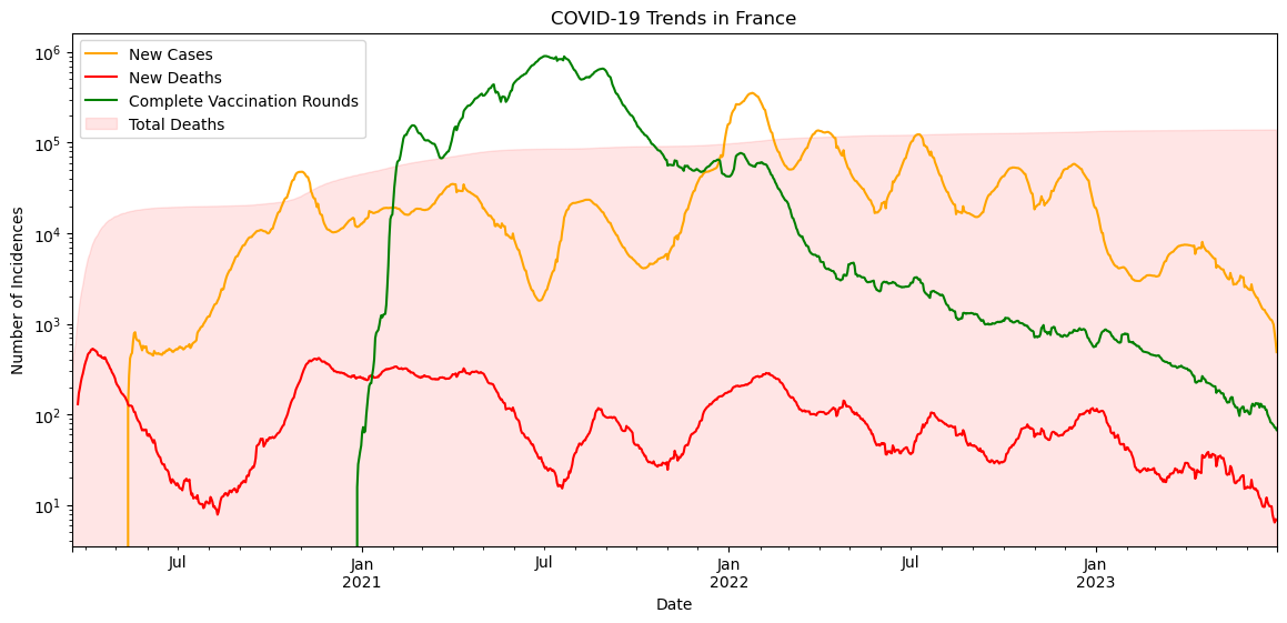
Graphing each incidence graph against each other on log scale shows the relationship between the different indicators. [2, 3]
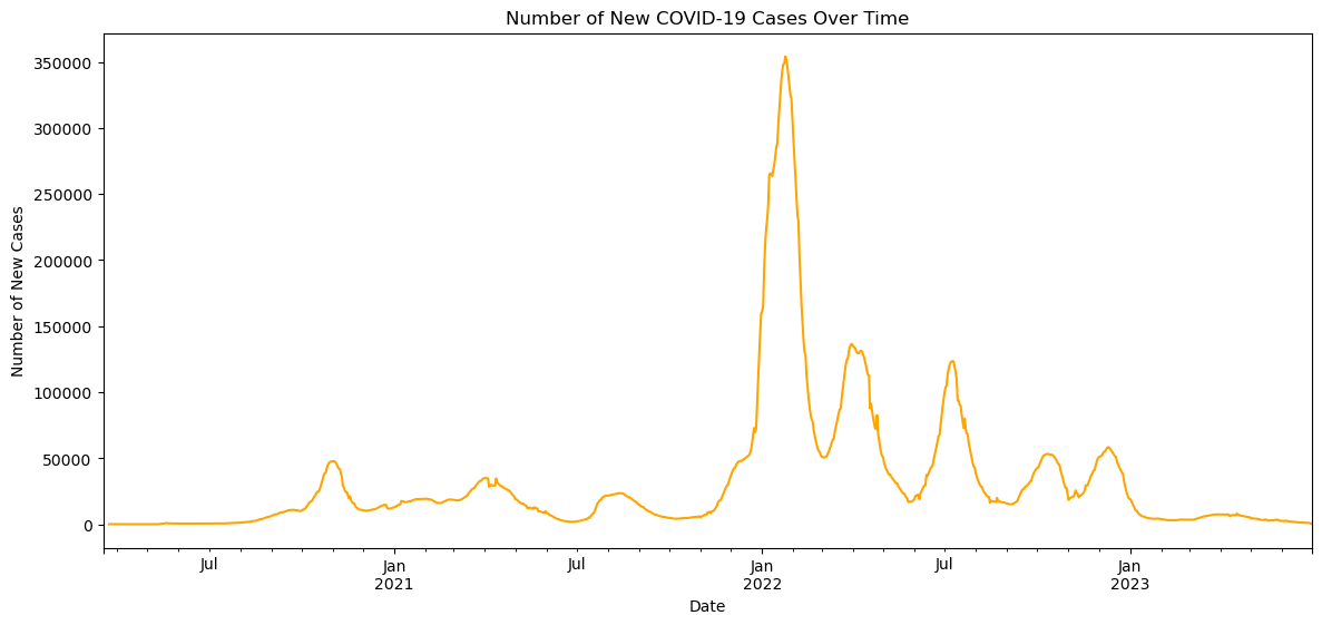
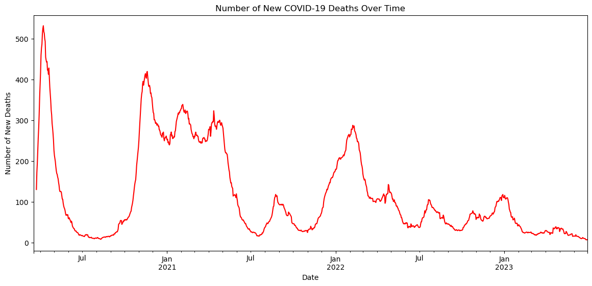
Case incidence and death incidence patterns obviously show strong correlation. Higher rates of positive tests is nearly always followed in a spike in the death count.
Cumulative deaths are graphed as the red area on this chart. The vast majority of deaths were recorded early in the pandemic. This could be due to medical care improving as knowledge of the disease advanced, but could also be due to the total death count from before the recording period all being collected at once.
Investigating data sets of this scale led to some interesting inconsistencies. One big discrepancy that kept occurring had to do with differences between incidence numbers and cumulative statistics. Very often summing incidences did not match reported cumulative numbers. Furthermore, counts from WHO vs. France's Public Health Agency sometimes varied. This project demonstrated how easily inconsistencies can arise during such a concentrated and high-pressure environment like the COVID pandemic, and how important it is to investigate your data sources carefully. [4]